

Heatmaps are a powerful visualization tool in data analysis, providing a color-coded graphical representation of data. This method of data visualization is instrumental in analytics, as it allows for the quick, intuitive understanding of complex data sets. The color-coding system in heatmaps represents different values, making it a valuable instrument in identifying patterns, trends, and outliers in data. This is particularly beneficial in fields where time is a crucial factor, such as UX design and website tracking. In the realm of web analytics, heatmaps provide invaluable insights into user behavior. These interaction maps can be used to optimize website design, improve user experience, and ultimately, enhance conversion rate optimization. The data represented in heatmaps can vary, from geographical data to matrix data, or even correlations between different variables. Essentially, heatmaps simplify complex data sets, making them more comprehensible and user-friendly in data analysis. With the boom of big data and advanced analytics, the importance and usage of heatmaps have significantly increased. They are now widely used across various fields, including statistics, geography, and computer science. The ability to visualize and interpret complex data sets quickly makes heatmaps an indispensable tool in today’s data-driven world.
What is a Heatmap?
A heatmap is a two-dimensional graphical representation of data where individual values contained within a matrix are represented as colors. This method of data visualization is widely used in analytics to visualize complex datasets and reveal patterns and correlations. Each cell in the grid of a heatmap represents a specific value, with the color of each cell corresponding to the value it represents. Different colors indicate different ranges of values, making it easier to understand the data at a glance. The use of color in heatmaps is a visual cue that aids in data analysis and understanding. Darker colors often represent higher values, while lighter colors represent lower values. This use of color makes it easy to identify patterns, trends, and outliers within the data, making heatmaps a valuable tool in website tracking and click tracking. Heatmaps are used in various fields, including biology, web analytics, and geographical information systems. For instance, in biology, heatmaps are used to represent gene expression data. In the field of web analytics, heatmaps, including scroll maps, provide insights into user behavior, showing where users click or scroll on a website.
What does a Heatmap Show?
A heatmap shows patterns, correlations, and trends in a dataset, using colors to represent different values within the data. This visualization tool makes it easy to distinguish between high and low values, and by doing so, heatmaps can help to identify areas of interest or concern within the data. For instance, in a website heatmap, areas where users interact most frequently may be colored differently from areas where interaction is less frequent. This provides insights into user behavior and website usability, aiding in UX design and conversion rate optimization. Heatmaps also reveal outliers within the data, which are values significantly different from the rest of the data. These values may be represented by a color noticeably different from the colors used for other values, providing a visual cue to quickly identify any unusual or unexpected results within the data. Furthermore, heatmaps can be used to compare data across different categories or groups. For example, a heatmap could be used to compare sales data across different regions or time periods. By displaying this data in a heatmap, it becomes easier to see which areas or periods have the highest or lowest sales. This visualization and comparison of data provide valuable insights that can inform decision-making and strategy in data analysis.
Zone-based Heatmap of Contentsquare
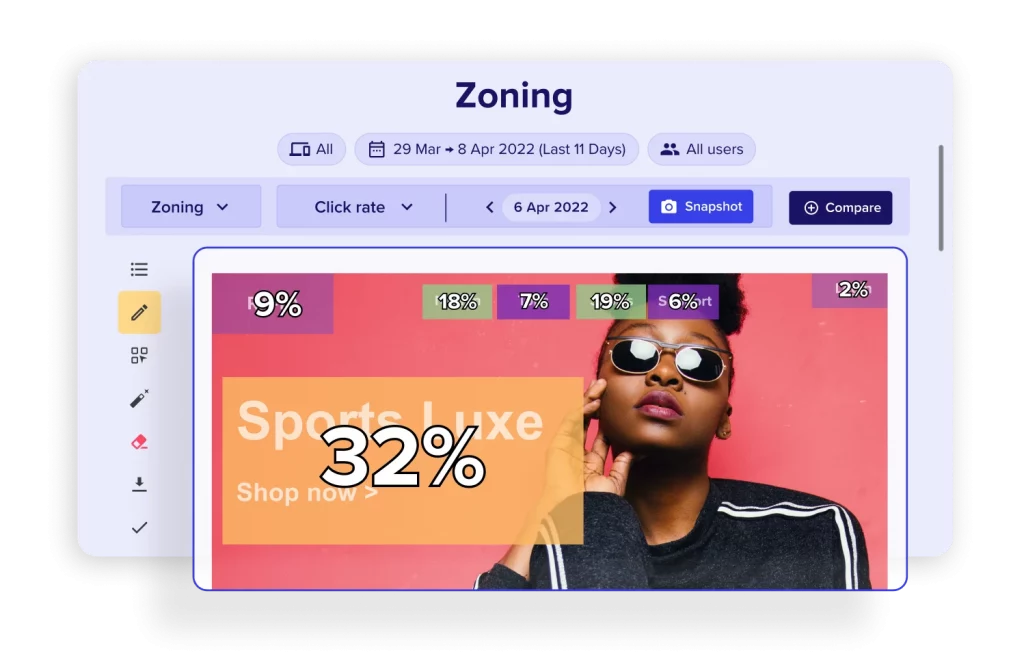
The module Zone-based heatmaps of Contentsquare is helping brand to discover opportunities in seconds with advanced heat mapping. It helps also revealing how users interact with each element on your website and your app. What you can do with this product is simply understanding what makes them click or tap, which elements attract their attention, and what content makes them bounce. Go beyond basic analytics metrics to understand why your web and app users behave as they do!
The Power of Visual Data: Heatmap Analysis
In the sphere of data analysis, heatmaps are a potent visualization tool, transforming complex datasets into user-friendly, color-coded graphics. Heatmaps serve as a vital instrument for discerning patterns, correlations, and trends in data, bridging the gap between raw numerical data and human perception. This form of visualization is a cornerstone in the analytics field, facilitating informed decision-making processes. Heatmap analysis is crucial in understanding user behavior, particularly in the context of website tracking. It offers insights into user interaction on a website, illuminating areas of high and low engagement, mouse movements, and click patterns – all vital aspects of UX design. This data is indispensable for website owners and developers, enabling them to pinpoint the strengths and weaknesses of their site. With heatmap analysis, they can refine their website design and layout to align with user preferences and behaviors, thereby boosting user engagement and conversion rates – a key objective of conversion rate optimization. The application of heatmap analysis extends beyond website tracking. It is utilized in diverse fields such as genomics, where it visualizes gene expression data, and geography, where it represents population density or weather patterns. In all these applications, heatmaps are instrumental in visualizing large datasets, enabling users to swiftly identify patterns and trends. Interaction maps, such as scroll maps, are particularly useful in these scenarios. In conclusion, heatmap analysis, with its capability to visually represent intricate datasets, is a vital tool in data analysis. By offering a clear, comprehensible visualization of data, it enables more effective decision-making processes. Whether it’s UX design, genomics, geography, click tracking, or any other field where large amounts of data are involved, heatmap analysis is a valuable resource.
Also learn more about Hotjar’s heatmaps tool here + a video that’s explain how the solution works: https://youtu.be/bD2CvkkZVgQ.