Have you ever started reading an exciting news article but then lose your line because all the text shifted downwards? This happens to me a lot, mostly because of ads loading around the content I’m reading.
This kind of user experience can be frustrating, but until now we’ve had trouble measuring it quantitatively. Cumulative Layout Shift addresses this challenge.
When you see a web page, you automatically break it down into visual elements. You perceive their relationship to each other according to their arrangement on the page. This is how you can identify where the relevant content is located. If this content moves by itself, or if another element is injected into the layout and moves the others, then you may lose sight of what you are focusing on.
LeMonde.fr Home page load. Inserted and moving contents are identified by light blue areas. The contents of about 2/3 of the screen moves during the page load.
And it’s even worse if you thought the layout was stable, and you were about to interact with the page. For example by clicking on a button (image on the left). If other content appears right before the click and pushes the other content downward (image on the right) you might interact with the wrong element of the page.

Overview
In this article, we will discuss the Layout Instability API and its use to compute the Cumulative Layout Shift (CLS). We’ll see how to visualize CLS in Chrome and how to optimize for it. Finally, we will address some of its unusual characteristics and conclude.
A Dedicated In-Browser API…
Viewing the elements that are shifted when loading and while using a page has been a long-standing need. A decade ago, you would need a custom-configured rendering engine (in the following example, Gecko, the Firefox rendering engine) to show every paint reflow.
Caution
This video contains lots of repaint. Don’t play if you are photosensitive or have vestibular disorders.
In Chrome today, you can use the Layout Instability API. Its original intent was to find more relevant signals than the onload event to determine when a page is loaded. Layout stability, or “lack of shift” was one of them. As stated in the API abstract, it “provides web page authors with insights into the stability of their pages based on movements of the elements on the page”. To do that, the API monitors the position of the visual representation of every node that is visible in the viewport. If a node’s visual representation shifts from the previous frame by 3 or more pixel units in either the horizontal or vertical direction, the API notifies a layout shift and scores it.
… Used To Penalize Jank
Let’s go back to our example:
How does the Layout Instability API score this? To compute the layout shift score, the algorithm first evaluates the area affected by the shift and multiplies it by the length of the shift.
The area affected by the shift, or impact fraction, is the total area of the moved node, from its first position to its final position. Here, 78 % +32 % = 110 %. As you can see, the impact fraction can be greater than100 % (the viewport size).
The length of the shift, or distance fraction, is measured according to the viewport’s largest dimension. So in this example, we’ll consider the height. The existing element moves by a height equivalent to 34 % of the height of the viewport.
In this example, and for this particular layout shift, the layout shift score is:
layout shift score = 110 % (impact fraction) × 34 % (distance fraction) = 0.374
The Cumulative Layout Shift (CLS) metric is the sum of (nearly) all individual layout shift scores.
The 500-millisecond window
To prevent websites from being penalized for transitions or animations that are the result of user interaction with the interface, the CLS algorithm does not record the layout shift for 500 ms after each active user interaction with the document (e.g. clicks, type, tap), or any event that directly changes the size of the viewport. We can consider that such shifts, resulting from an action, are expected by the user.
According to Google, to provide a good experience, sites should strive to have a CLS of less than 0.1 for most (75 %) users. This is bad news for the developers of the above example!
Keep in mind that the impact fraction and distance fraction are highly dependent on the viewport’s characteristics. A change in your viewport’s dimensions or even orientation can change your layout – adapting responsively to the available space. Thus your impact fractions,distance fractions and, in the end, your Cumulative Layout Shift will change.
How To View Layout Shifts in Chrome
Layout shifts can be displayed in Chrome.
- In the DevTools, open the Command Menu with Control + Shift + P or Command + Shift + P (macOS)
- Start typing ‘Rendering’
- Run the Show Rendering command.
- Enable the Layout Shift Regions checkbox. As you interact with a page, layout shifts are highlighted blue.
Warning
As stated above, this feature may cause flashing. If you are photosensitive or have vestibular disorders, use it with caution.
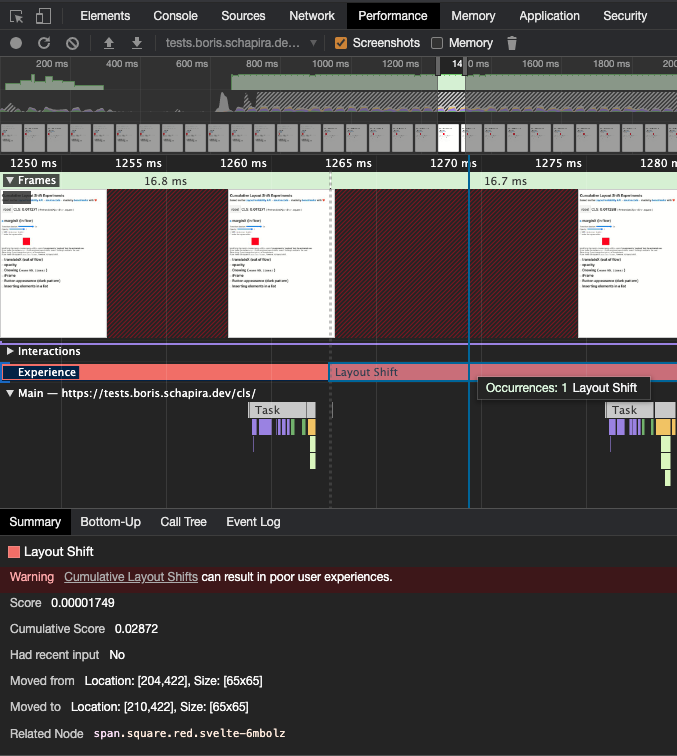
Since Chrome 84, you can also visualize Layout Shifts and get information about their attribution (even down to the shifted nodes) in the Performance tab, on the ‘Experience’ line.
How To Optimize Your Cumulative Layout Shift
A page accumulates layouts shifts throughout its use. Each time new elements are visually inserted without the necessary space to display them being reserved by the browser. These insertions will often be images, but you also have to be careful with ads, web fonts, embedded content, and contents injected following an interaction that generate waiting times of more than 500 ms.
Images
When it receives the HTML code for your page, the browser doesn’t know much about the images used in it. With no more information than the URL of an image, the browser does not know its size, so it cannot allocate the proper space for the image to display. This has become even more complex since the advent of Responsive Web Design. The display size of an image often depends on the context.
To give as much information as possible to the browser so that it can do its job to the best of its ability, always set a width and a height attribute on your <img> tags (in pixels). Even if these are not the actual display dimensions (which may depend on style rules), the browser will use them to infer the width / height ratio (called aspect-ratio) of the image, and thus calculate the height to be reserved based on the display width defined by the CSS.
Did you know?
Edge, Firefox and Chrome have an internal mapping of aspect-ratio for images that defines both width and height attributes. An experiment is ongoing on Chrome to open the feature to developers.
.el {
    aspect-ratio: 16 / 9;
}
/* internal rule for img, using the --webkit prefix (in Chrome)
img[width][height] {
  --webkit-aspect-ratio: attr(width) / attr(height);
}*/
Learn more about aspect-ratio with Chris Coyier, on CSS Tricks.
And of course, remember to serve the right file size regarding the context. Use srcset to help the browser select the best image in your image set with the same aspect ratio (this depends on the rendering width). Use picture and source for different aspect-ratio or different image formats based on the context and browser support.
Ads, embed, iframes, and on-load dynamically created content
As with the images, the browser needs to allocate the appropriate space to render the final content. But you can’t give much info to the browser, as you have yourself little information about the future content. In the following I will only talk about ads, because they raise the most challenges. But the mechanics are the same for the other types of injected content.
In the following, we will discuss the impact of content injections on the main page template. It’s worth noting that if an iframe produces CLS within itself, it does not impact the main page.
More often than not, advertising space is allocated to a bidding service that injects a container into a dedicated node. Then, this space is ‘rented’ to the highest bidder, allocated to a network that then injects an advertisement. The space may be resized several times before the final ad is displayed, and in the case of timed ads, additional injections may occur multiple times during the users session.
How to prevent layout shifts from happening?
Explicitly define the space allocated to the ad container. If the ad is smaller than the allocated space, plan a background cover that will skin the available space. If the advertisement is larger than the reserved space, some of it will not be displayed.
Sometimes no advertising fills the area. Plan for visuals of the correct size so that you don’t have to collapse the advertising space and provoke a layout shift. If your network provides you a way (through a JS callback, for example) to inject useful content in the absence of advertising, of course, do not hesitate.
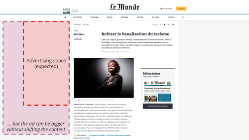
Another way to solve this problem is to position the ads in the negative space left by the content of the site, out of the page flow. If your ad has a fixed position in the page template, and that position does not interfere with the flow of the rest of the content, then inserting the ad does not cause any shift.
You can also move your advertising slots lower down on your pages. This will prevent the layout shift impact fraction from being too large, but this will likely reduce your revenue.
Web fonts
When a browser needs to display text with a web font, it identifies whether the font is needed and available (on the system or in the browser’s cache). If the font is necessary but unavailable, then the browser fetches it. During the fetching phase, the browser follows the font-display instructions (or lack of) to determine whether it should render the text with a fallback font or allocate the space with invisible text. When the font is available, or if the waiting time is too long, then the browser proceeds with the final rendering.
In other words, whenever the browser has to fetch a font, it allocates the area with text using a fallback font, visible or not. And when the font is finally available, the browser renders the text area again using the web font. However, the temporary font does not necessarily have the same characteristics as the final one. Baselines, point sizes, kernings can differ and the final text may appear shorter or longer than the temporary text, causing layout shifts.
Every time I need to remember how font display management works, I go back to the font-display playground, by Monica Dinculescu.
To avoid these layout shifts, you can speed up font loading. You can also choose web fonts with characteristics similar to system fonts, or consider the web font as optional the first time the page is loaded. It will then not be used on this page, even if downloaded and cached. Instead, it will be available on the next page. You can read more about this in ‘eBay’s Font Loading Strategy’ by Senthil Padmanabhan.
Content injected more than 500 ms after an interaction
The CLS algorithm ignores Layout Shifts for 500 ms after each active user interaction with the document or change in viewport size. Thanks to this behavior, most user interactions do not cause layout-shifts that are recorded in the Cumulative Layout Shift.
But you have to make sure your UI will react to the user interaction within the 500 ms window. If your UI relies on network requests or heavy javascript processing, shifts might occur after 500 ms and will so be taken into account in the Cumulative Layout Shift value.
To optimize your CLS:
- Make sure that your transitions and animations that follow user interaction last less than 500 ms.
- Measure and optimize your APIs response time.
- Anticipate the result of the network call(s) or long treatment by allocating the result area during the 500 ms, even if it is to be filled later on (you can use an optimistic UI pattern).
- Implement a specific UI paradigm for long processing and network call (queuing and completion notification system, modals etc)
- Only animate CSS properties that do not trigger layout changes in Blink.
Of course, always test. While conducting some experiments to write this article, I discovered that layout shifts are created when the duration of a translate transition is 0 (this is fixed now). Edge cases like this will always exist. Please report them to the Chromium Team.
Tip: two-step processing
Take the example of a “Load 20 more articles” button at the end of a page. If the processing (aka network call + rendering) takes less than 500 ms, no problem. But if it takes longer than 500 ms, the rendering may cause the footer to shift and increment your Cumulative Layout Shift.
To avoid this, you can monitor the elapsed time and split the task in two parts if need be. Instead of rendering systematically after the network call, you can change the button label to “Show all 20 retrieved items”. This will force users to interact again with the page and grant you 500 additional milliseconds for rendering the content.
Of course, do not hesitate to ask the users to check if the use of thefunctionality better meets their needs. Optimizing the CLS should not be at theexpense of the UX.
Counter-intuitive behaviors
Continuous accumulation in Single-Page Applications (SPAs)
While most performance indicators are related to the loading of the page, the CLS is focused on the whole experience of loading and interacting with a website.
Many websites are structured on a page to page, URL to URL navigation paradigm. For them, the CLS is reinitialized with each navigation. Some sites, on the other hand, are built around a single page the content of which evolves through interactions, through JavaScript. These are called Single-Page Applications (SPAs).
On SPAs (including applications that use progressive enhancement turbolinks-like libraries), the Cumulative Layout Shift may never stop increasing during a user’s sessionsession, as the navigation between contents is not achieved by navigating between pages. The Cumulative Layout Shift will only be collected when the user leaves the page. If the Cumulative Layout Speed value you see in the Search Console (in the ‘Core Web Vitals’ section) seems high, maybe that’s an explanation.
Note
This specific point about Cumulative Layout Shift is particularly important. As it means that the goal of SPA developers should not be to reduce the number of layout shifts, but to design interfaces that don’t produce any layout shift at all. If they don’t, the more popular their interfaces are, the longer the session durations will be, and therefore the higher their reported CLS will be.
Scrollbars appearance penalty
This may seem counterintuitive to some, but horizontal and vertical scrollbars are part of the viewport. A great example of this is they’re included in the viewport-percentage length such as vw or vh. This implies that the appearance or disappearance of scrollbars does not modify the viewport size even though it changes the area available for content, and causes layout shift.
Unfortunately, on some Operating Systems, like Windows, scrollbars are hidden until they’re needed, which can lead to a scrollbar missing from First Paint, then added later during the page load, and that may cause layout shifts.
To avoid this behavior, you can add html { overflow-y: scroll } to enforce a scrollbar at First Paint, or wait for the implementation of CSS Overflow Module Level 4 and the new scrollbar-gutter property.
Impact of the timing-function
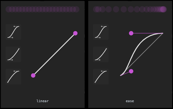
In the following example, we compare two flex arrangements. In the first one, the central element doubles in size when hovered, using an “ease” timing-function. In the second example, a “linear” timing-function is used.
As you can see, the second example generates much less Cumulative Layout Shift. To explain this, we need to go back to the Layout Instability API spec, and more precisely, to what is called “Unstable nodes”.
A Node N has shifted in a coordinate space C if the starting point of N in C differs from the previous frame starting point of N in C by 3 or more pixel units in either the horizontal or vertical direction.
This “three pixels between two frames” rule introduces a speed criterion in the instability measurement. All elements moving below this speed are not considered unstable, and these animations do not produce a layout-shift.
Unfortunately, this means that to reduce CLS, some site owners might be tempted to use linear animations, which have a constant speed, rather than ones more intuitive to humans, such as “ease”, that speeds up at the beginning of the animation and slows down at the end.
Other strange behaviors of the metric
- Animated elements that create layout shifts may continue to do so if they are not visible to the user (for example, even with a color that blends with the background). But if you use
visibility: hidden, they won’t. - The web.dev CLS page recommends using
transformandtranslateto create animations that do not produce layout-shift. However, a bug in Chromium seems to create layout-shifts when the transition time is 0 in Chrome, until version 86.
Conclusion
Cumulative Layout Shift is a metric that measures the layout instabilities of a web page. To optimize it, and improve the user experience, you should avoid injecting content for which the browser has not allocated the right amount of space. There are several techniques that exist for images, but this will, however, make advertising management much more complex.
The way CLS is computed infers unusual characteristics. The current algorithm of CLS is probably not a good fit for Single Page Applications, as the attribution of results at page-level is not properly handled. Thus, Core Web Vitals as a ranking signal might be particularly challenging in such cases.
Keep in mind that CLS is a new measure. We still lack feedback at scale. When in doubt, always focus on improving the User Experience instead of the metric itself. Some CLS optimizations may work against this goal and should be avoided.
Browser Support
Steve Kobes announced that Blink (the Chrome rendering engine) intended to implement such an API in October 2018. Work on the draft Layout Instability API began in May 2019, and the API released with Chrome 77 in September 2019 and later in Edge (80+). Daniel Holbert created a ticket for Firefox in July 2020. We did not find any mention of the Layout Instability API in Safari’s public ticketing platform.
Resources
- Boris’ Cumulative Layout Shift experiments
- “Layout Instability API specification”, by Steve Kobes, Nicolás Peña Moreno & Emily Hanley
- “Cumulative Layout Shift”, by Philip Walton and Milica Mihajlija
- “Optimize Cumulative Layout Shift”
and “Infinite Scroll without Layout Shifts“, by Addy Osmani - “Web Vitals – A New Hope in Web Performance Measurement”, by Dave Smart
Thanks to Damien Jubeau and to Matt Hobbs for their contributions and for helping me improve my English!