“Reduce the page weight”: here is one of the most usual tips in Dareboost reports.
According to HTTP Archive trends, images represent 53% of the average pages weight, whether viewed on desktop or mobile devices. When you want to reduce the weight of your web pages, optimizing images should be at the top of your priorities.
For each image its format
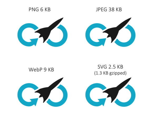
It is not always easy to find the most suitable image format. Take our logo, for example. We could save it in PNG, JPEG, WebP or SVG.
The weight of the images would be very different. An empirical test allows us to visualize it:
In this case, the most suitable format seems to be SVG, followed closely by PNG. It is indeed an image whose colors are plain, non-animated, representing geometric shapes. All these factors tend to favor these two formats.
Let’s take a second example, this time with the photograph of a rocket taking off. SVG is just unable to represent this image correctly (we will explain why a little further). Here’s what we get, with equivalent visual perception, for JPEG, PNG and WebP formats:
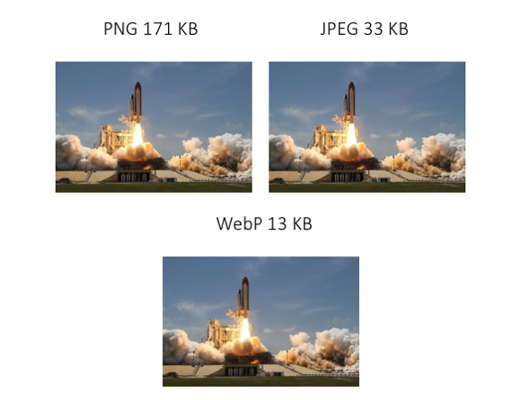
Here, the results are radically different. To represent the complexity of a photograph, the WebP format clearly stands out. Unfortunately, it is only supported on Chrome and Opera, so we generally prefer the JPEG format.
Tip: for each of your web performance test on Dareboost, our tool systematically checks if the PNG format has been properly used (or if you should consider using another format).
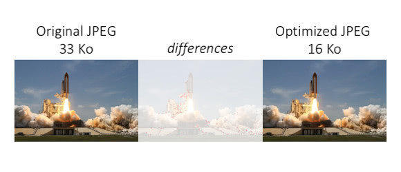
When you want to save a JPEG, most of softwares ask what quality to retain, as it is a lossy encoding format. By choosing a quality less than 100%, it is thus possible to save precious bytes by correcting only certain points of the image. Let’s try with our image, with quality set to 80%. Then we get a very interesting result: a weight loss of more than 50%, while only a few points of the image have been deeply changed.
As shown above, choosing a format is not trivial and not all formats are suitable for all images. Let’s explain a little more…
How to choose the right image format?
In the end, all the images appear on the screen in the same way: a rectangle composed of several dots of different color. But images are not necessarily recorded like that on the disk. And each image file format relies on different techniques for encoding visual information. In order to choose the right file format, you need to ask yourself several questions:
What does my image represent?
Some file formats encode images in the same way as they appear on the screen: like coloured dot matrices. Each color point is encoded on several bytes and positioned within a map according to its coordinates. That’s why these formats are sometimes called “bitmap”. Various compression algorithms then reduce the space taken by this information on the disk. For these formats, we speak about “raster graphics“. Their advantage: they can handle any photograph and some of them, as the PNG format, come with advanced features like color palette optimization or transparency.
Unfortunately, this encoding process must define the dimensions of the matrix first, that is to say the resolution of the image, before positioning the points. As a consequence, if you enlarge an existing JPG, PNG or WebP raster graphic, you will dramatically decrease the quality.
Other file formats do not have this drawback because they encode images as a set of geometric shapes. They define an image through the lines, points and polygons that compose it. Whenever the image is to be displayed, the computer redraws it following this virtual drawing specification. These vector graphics are very suitable for rendering simple shapes, logotypes and data graphs. Since they are not resolution-dependant, they are particularly adapted for Responsive Web Design. SVG images and icon fonts are vector formats. On the other side of the coin: vector graphics are not very suitable for photographs.
Reduce the weight of images by sacrificing information
It is possible to optimize further by losing some information in the process. Of course, the challenge is to lose only the bare necessities, while maintaining an interesting level of quality. This is called the lossy optimization phase.
For vector graphics, svgo is today a reference tool. An online interface even exists: svgomg. The tool is able to reduce the amount of code by cleaning metadata that is useless for display (for example, information about the tool that was used to generate the file) but also by bringing together several geometric shapes or transformations. To reduce the weight of an icon font, the logic is the same, except that you can also reduce its scope of action by selecting only the characters used to build your custom character set. Several sites, like Icomoon, allow you to create your own icon font.
As we saw in the example of the rocket ship, lossy (or not-lossy) optimizations are also possible on the raster graphics. Since each image format has its own characteristics (for example, the transparency of PNG support), each algorithm has a different mode of action and a specific visual impact.
Here are some file formats and some suitable optimization tools. Some of them are included in graphic softwares like Photoshop or GIMP:
- PNG: Zopfli-png, PNGOUT, OptiPNG, AdvPNG, PNGCrush, PNQQuant
- JPG: JPEGOptim, MozJPEG, Jpegtran, Guetzli
FileOptimizer (Windows), ImageOptim (Mac) ou Trimage (Linux) are softwares that combine several algorithms in one place. They allow you to test these optimizations with various levels of loss and directly export an optimized image. They are even able to determine whenever a PNG image can be saved in PNG-8 (a variant of PNG with a 256-color palette) rather than PNG-24 to gain some precious bytes.
Why don’t you talk about GIF?
GIF is a very constrained format (it can only describe 256 colors) that supports transparency and animation. Used for years to encode logotypes, pictograms and small animations, GIF needs to – let’s say it out loud – retire for good.
You can find features stamped “GIF” in all social networks or instant messaging applications, but that’s not really the truth. In fact,
many of these services use video formats, with much lighter files! We will come back to this topic in a future post.
If you still need the GIF format, be aware that a command-line compression tool also exists: gifsicle. It can be very useful for manipulating GIF content: reduce the color palette, resize, cut and crop… I sometimes use Gifsicle to encode short recordings of my screen and integrate them into emails, because many mail clients are not able to read embedded videos.
Serve the right file size regarding to the context
Choosing the right file format is not enough to ensure that you will serve the optimum image each time.
Imagine that you are using a 2680-pixel wide image to decorate the background of a site designed for a computer with high-resolution display (HiDPI, including Retina™). On a mobile device of lower resolution, in 3G, not only will the browser load a lot of unnecessary data but, the browser will also resize the image with its internal algorithm for the image to fit in the width of the phone screen. The final result will be degraded, not to mention the rendering latency… Instead, you would rather produce several versions of the original image, in different resolutions and let the browser choose the image to download, depending on its execution context.
“Responsive Images” is a denomination that embodies all the techniques that consist in producing, for the same area of a Web page, several images adapted to the possible contexts of navigation. For background and decorative images, you can use CSS media-queries.
For non-decorative images, the picture specification has added the attribute srcset to the <img> element in 2014 (yes, three years already!). The srcset is a collection of URLs pointing to multiple versions of the same image, with different resolutions (but still the same width-to-height ratio). It gives the browser the responsibility to choose the version of the image to download, depending on the current context. Unfortunately, without having downloaded the CSS files from the web page, the browser can not understand the relative space occupied by the image in the window, so the sizes attribute must also be defined.
If you want to offer, in addition to your optimized image, formats supported by a limited number of browsers (such as WebP) or if you want to manage different width-to-height ratios depending on the context (a matter of artistic direction), you can frame your image with a picture element and several source elements:
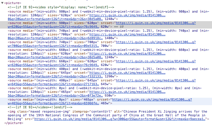
With all possible media, art direction alternatives, resolutions, pixel densities, and supported formats, the HTML markup of responsive images can become very impressive. But do not forget that your HTTP responses must always be gzipped. Finally, the difference of 500B between this markup and a single element img will be largely offset by the reduction of the weight of the delivered image.
Note that even if the support for the necessary HTML elements is fairly recent, a reliable and recognized library allows support on older browsers: picturefill.
Automate, automate, automate
Choosing the right image format, generating thumbnails, sometimes using alternative formats that are more adapted to the context (like WebP) and thus generating yet again some thumbnails… Manually perform this work on a large amount of high-quality master images is titanic. Very few tools, whether they are WCM or e-commerce platforms, include advanced features on image management. Even Digital Asset Management solutions, which are normally dedicated to visual asset management and where Responsive Images management should be a prerogative, are often useless.
Nevertheless, some solutions exist, like Cloudinary – a third party service available in SaaS – or Thumbor (an appliance that you need to install on your network). Discuss with your web development team to determine the best tool and remember to explain the issues to the contributors and train them to the chosen solution. Do not forget to always keep the original images (those of the best available quality) and to think up ahead about the optimizations, even lossy, that you want to apply.
For example, on an e-commerce website, photos of products are more critical than decorative images, so you will not want to lose too much quality. Similarly, if you are in the luxury market, your visitors expect an impeccable image quality. You will need to fine-tune the configuration of your optimizations. Sometimes, as was the case with Flickr, the right setting may take several months to emerge.
Lazy-load what you can (with or without visual effect)
Another way to improve the performance of a web page is to avoid unnecessary images during initial loading. For example, you can delay the loading of all images that are not displayed in the visible area of the web page (see our dedicated post on Lazy loading). There are many JS libraries to do this but some of them will not be compatible with your existing code: ask your development team for advice or suggest an independent, vanilla library like Lozad. A lazy loading feature is also available on Apache and nginx: ModPageSpeed Lazyload.
One of the problems with Lazy Loading is the sudden display of the image, only after it is loaded. It is therefore necessary to determine when and how to load the delayed images so that the user does not notice this phenomenon. But when? After the initial loading (onload) of the Web page? When the user scrolls through the content and the viewport is approaching of the considered area? The lazy-loading needs to be discussed with UX designers who may have ideas on how to animate the appearance of the image, to make it less harsh. Some websites occupy the area with a branded content. Others use the main color of the image or even a shape of the actual image in SVG.
We have dedicated another article to this technique: Lazy Loading, faster webpages, SEO friendly
Reduce the number of images with an image stack
On high-latency networks, you can quickly save time by reducing the number of images to download. Rather than including each image in a separate image file, the images can be grouped into a single file. Image Sprites are an example of this technique applied to raster images. Icon fonts and SVG symbols are the equivalent implementation for vector images.
How attractive could seem this idea, its implementation can be complex though. Using an image sprite is a useful technique if you really use all the grouped images on the web page loading the resource, which is quite rare. In addition, if you need to replace a single element in the stack, note that you will need to invalidate the entire sprite from the browser cache.
Finally: latency may not be an everlasting problem. With HTTP/2, a protocol in which connections are optimized to download multiple resources simultaneously, the technique would lose its meaning. Theoretically speaking.
The end?
Heck, no! The state of the art of (responsive) image management is still far from perfect.
For example, instead of sending a lot of information to the browser and let it choose the right image regarding the context, why not ask the browser to pass the context during the initial query and calculate all the contextualization server side? This is what some members of the What WG are thinking about in the “Client Hints” specification. Support is still very limited but the concept is being standardized at the IETF. This is very much like an early 2010 initiative, called Responsive Web Design + Server Side Components, aka RESS, which was already trying to implement server-side mechanics.
Will it succeed this time?
Great work Boris,
Optimize image and responsive optimization always brings traffic and visibility. This resource is very useful to accomplish my pending work on image optimization.
I’m glad to hear that! I hope your optimization will go well.
Well written article with a lot of insight, Boris! I agree with resizing images so that they serve the purpose. This will go a long way before we analyze what are the best compression methods. Usually, for web publishing, I would go with a lossy algorithm and aim to balance between quality and file size.
Thanks again for a well-written piece!